
Our most powerful brand asset and our unmistakable identifier.
Combined with a round-edged serif wordmark, the fingertip creates a distinct logotype. A simple yet impactful logo for a strong, consistent message.
The comprehensiveness of our catalog of products and brands meets the double sense between online purchase and cosmetic application, both of which are made with the fingertips.
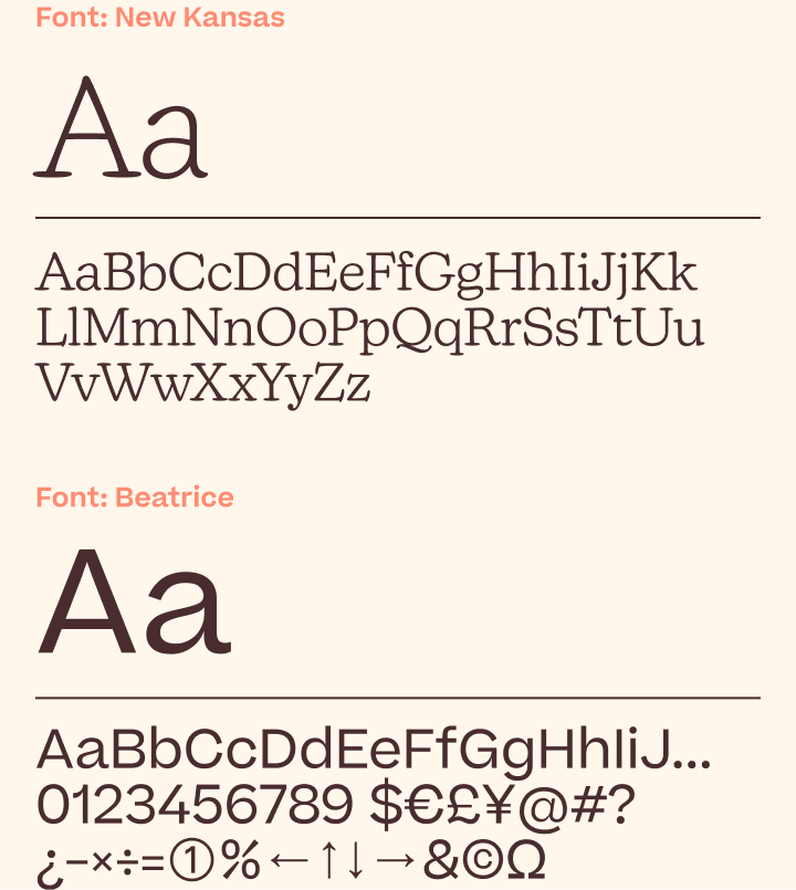
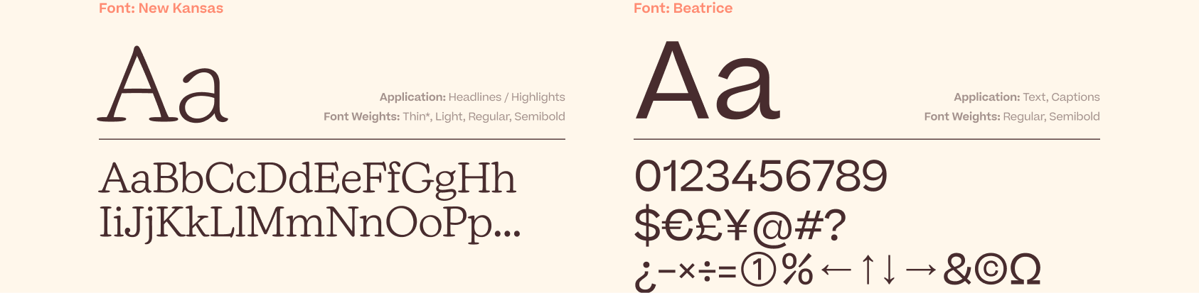
A new voice that’s both friendly and elegant, while ensuring uniformity across all touchpoints and forms of communication.
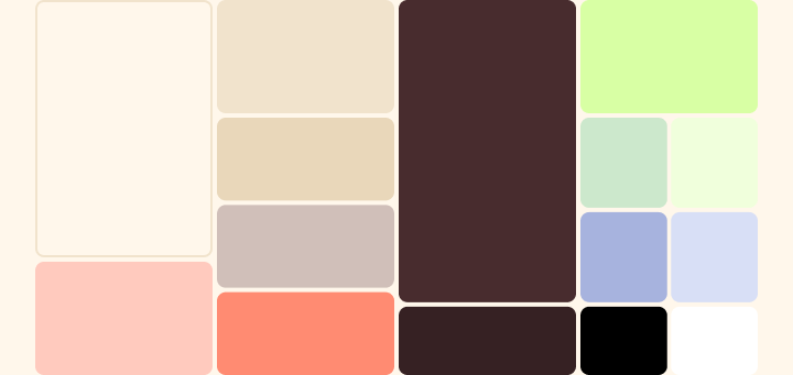
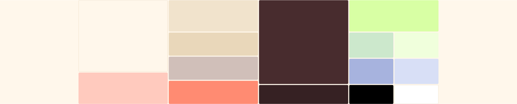
One of our brand’s most powerful and recognizable assets. Our most iconic colors are the Brown and the Salmon, a dynamic and unmistakable combination mixed with the vibrant secondary colors, to a broad yet defined color palette.

Inspired by old, framed photos and the marks of the fingertips, Care to Beauty translated shapes into their simplest possible forms. Clear and recognizable at a distance they are the backbone of the identity’s form language.


Bespoke icons that are visually inspired by our design DNA. Ensuring unified and accessible communication is a crucial part of conveying our desire to be helpful and approachable to all.
On this important mission, the immensely talented creative agency Bürocratik was at our side. We couldn't have been in better hands!